 Dark mode design for mobile apps has become a hot topic recently. When Apple released iOS 10 in 2016, they offered an API called Dark Mode that developers could utilize to turn the app into dark mode. Not long after this release, Google followed suit with Android Oreo and their own version of Dark Mode – Night Theme. Even though these two platforms are still not consistent in their approach to dark mode, more apps have started using dark mode. Dark mode is a great design solution for apps that use predominantly black elements because it allows the user to save battery and eyesight by reducing the glare on the display screen at night.
In order for your mobile app to be compatible with Android Oreo and iOS 10 or higher, you will need to design a dark mode. The process for designing dark mode is complicated and filled with many pitfalls that can result in an unusable app if the designer isn’t careful. In this article we are going to go over everything you need to know about designing a dark mode from the perspective of a mobile UX/UI designer.
First off, the most important thing to know about dark mode is that it doesn’t necessarily mean turning your app black and white like the Twitter or Google+ apps. Dark modes are different depending on which platform you’re targeting, as well as how strictly you want follow their guidelines. The documentation for Android Oreo states that dark mode is defined as:
“An alternate theme that colors the user interface elements black (for dark background) or white (for light background), and in some cases grayscale.”
This means that you can use different variations of a dark color for UI elements and still be considered Android Oreo compliant. For iOS 10, Apple states that dark mode is defined as:
“A black or dark-gray interface.”
Apple is very strict about their guidelines and the only UI element you can use that isn’t a flat color in iOS 10 apps is an image with transparency. This means that any UI elements must be either black, white, or have some level of transparency in order to be placed on top of the dark background.
More on Design for Dark Mode
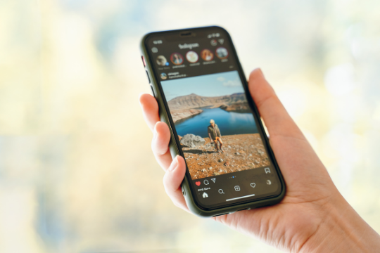
The design trend with dark modes is to have a black or very dark grey background and use lighter elements against it. This approach looks more visually appealing than white text on a black background, especially in apps where there are many light colored UI elements like Messenger, Instagram, and Gmail. With that being said, there are some apps that continue to use mostly white UI elements despite having a dark mode option.
This design inconsistency can make it difficult for users to know if an app has a black or dark grey background and can lead to frustrating user experiences when light UI elements blend into the background and become unreadable.
The best way to avoid this issue is to make sure your app has a flat, black background and then choose UI elements with contrasting colors. If you have a blue button in your interface, it should be either white or grey against the dark background. This concept applies to text as well — if your app has long bodies of text or lists that are very light colored, consider using a white or very light grey color for them so they are readable.
Designing Dark Mode – Tools to Use
There are a number of tools that you can use to create dark mode for your app depending on what platform(s) you are designing for. You can always design in Photoshop and then port the images to Android or iOS, but if you’re starting from scratch this process will take significantly longer.
The following is a list of tools that can be used to design dark mode in various situations:
Photoshop
Photoshop is by far the most useful tool for designing interfaces. It has robust color and layer options which allow you to create both iOS 10 and Android Oreo compliant dark modes. You can then export the design as a .psd file and upload it to Sketch or another vector tool for further development.
Sketch
If you have existing designs in Photoshop, you can open these files directly into Sketch so that they will retain their layers. You can then add new objects onto the background layer in Sketch and export them as a png file. Note that if you have images with transparency, these will not work in Sketch so it’s best to leave them in Photoshop until after you are done developing your app.
Android Studio
Android Studio is Google’s recommended IDE for Android development and has a built-in feature called Image Asset Studio that lets you easily create dark mode assets from existing images. You can also use Android Drawable Importer to import assets from Photoshop, although this process is more time consuming than using Image Asset Studio.
Xcode
If you’re already an iOS developer, Xcode is the most convenient tool to use. It has a dark mode feature that can be enabled from within the Interface Builder, and since its assets are vector-based it makes it easy to export them as .pngs for Sketch or Android Studio.
Process of Designing Dark Mode
The following are the steps you should follow when designing in dark mode:
- Create a new document in Photoshop or open existing PSDs
- Draw all UI elements on the background layer
- Change all lighter UI elements to their dark color variations (if applicable) and leave the darkest UI element
- Group objects that are related together so they can be easily moved as a single entity later on if needed.
- Change all text to darker colors (if applicable)
- If your app has a lot of black or white space, consider changing this to dark grey instead. It’s better to have some form of color in the empty spaces so users can easily discern between different UI elements.
Timeline to Design Dark Mode
As you can see, creating dark mode design assets takes a lot longer than developing the rest of the app. Before starting this process, you should have already developed your UI in light mode and then applied color schemes that will work well with dark mode (this is more important for iOS apps because Android Oreo has an automatic dark mode that only applies to the status bar and navigation bar).
After this, you should aim to have your first iteration of a dark mode design finished by Week 6 of your development timeline so that you can test it with users and get feedback. This will give you enough time to make any adjustments before the final development stage starts in Week 8 (as an example).
Conclusion
In conclusion, designing dark mode is a complex process that requires extensive planning and more time than standard app development. However, the preview images above show how much more compelling your app can look when you use color schemes that work with dark mode.
Sunvera Software develops next-level software applications from start-to-finish. We are a premier software and mobile app development agency specializing in healthcare mobile app development, custom mobile app development company, telehealth software, sales dashboards, custom mobile app development services, retail software development, supply-chain software, ecommerce, shopify, web design, iBeacon apps, security solutions and unified access software.
We are proud partners with Amazon AWS, Microsoft Azure and Google Cloud.
Schedule a free 30-minute call with us to discuss your business, or you can give us a call at (949) 284-6300.